.jpg?width=100&name=JHAL%20headshot%20(2).jpg)
Providing your B2B customers with the best e-commerce experience isn’t an easy task. And you shouldn’t simply adopt the same strategies as B2C brands because there are differences between B2B and B2C customers.
To inspire you, we’ll be sharing some of our favourite B2B e-commerce website examples. Perhaps a few of these will give you just the spark of inspiration you’ve been looking for to stay ahead of your competition.
- Microsoft’s easy navigation gets users to where they want to be
- WiFi SPARK’s graphics keeps users engaged
- Blake Envelope keeps it interesting
- Polycom’s direct language puts customer needs first
- Quill’s all-inclusive package revolves around customer experience
1. Microsoft’s easy navigation gets users to where they want to be
Both B2B and B2C customers are busy people but B2B in particular? They may be in even more of a rush, for example, they might be squeezing in a quick five minutes to research a solution (because their Head Of has been chasing them) before hopping into a meeting.
So, you must make it easy for your B2B customers to quickly and seamlessly find what they’re looking for (whether they know what they’re looking for or not).
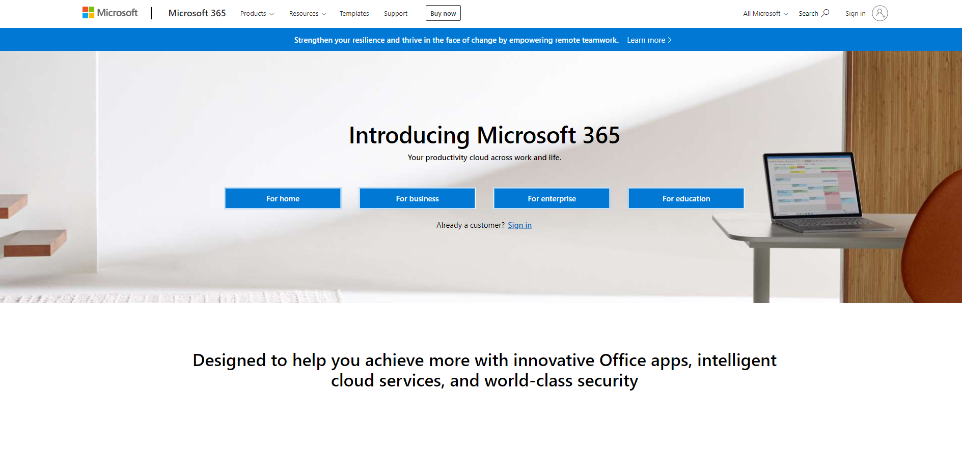
Microsoft does a great job of splitting their website up into various sections. For instance, the Microsoft 365 page is split into:
- Home
- Business
- Enterprise
- Education
Not only does this clearly separate B2B customers from B2C, but it even divides the different types of B2B customers from each other, such as small businesses from enterprises. This makes it clear for each user to enter the section they should be in and easier for them to find what they need.
2. WiFi SPARK’s graphics keeps users engaged
More and more B2B customers are starting their buying journeys online. In fact, 61% of B2B transactions now start online and they want the same user-friendly, seamless experience as their B2C counterparts.
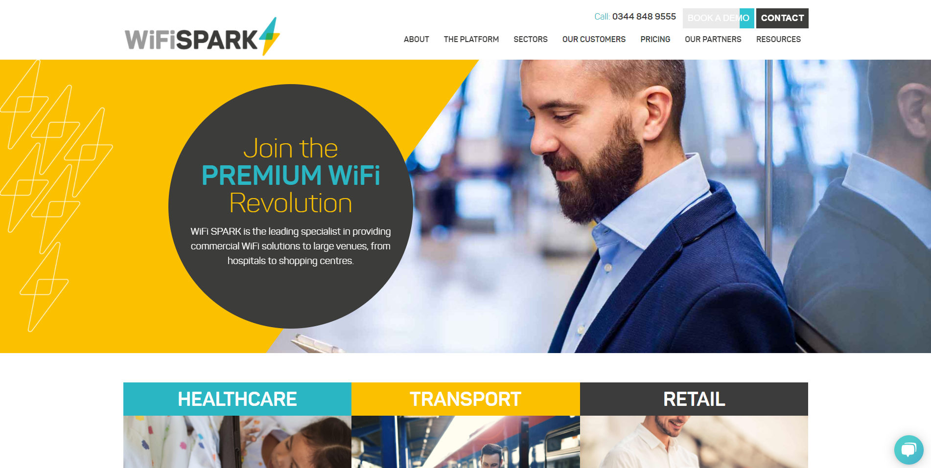
See the 'Book Demo' button in the top right corner which is fading from teal to grey as I hovered over it?
Business WiFi solutions provider WiFi SPARK meet this expectation with their website’s engaging graphics and features. Like Microsoft, their website is neatly divided into their three sectors (healthcare, transport and retail) so customers can quickly what the company specialises in and navigate to what they need.
Their website also has the following animated features to keep users engaged and delighted:
- Clickable links are underlined when you hover over them (in the main navigation bar, these lines even ‘swipe’ in)
- Buttons change colour when you hover over them
3. Blake Envelopes keeps it interesting
Maybe you think your business doesn’t sell anything particularly interesting or it’s an oversaturated market. In both of these cases, it’s important you don’t blend into the background. In the case of Blake Envelopes, it may be a mixture of both.
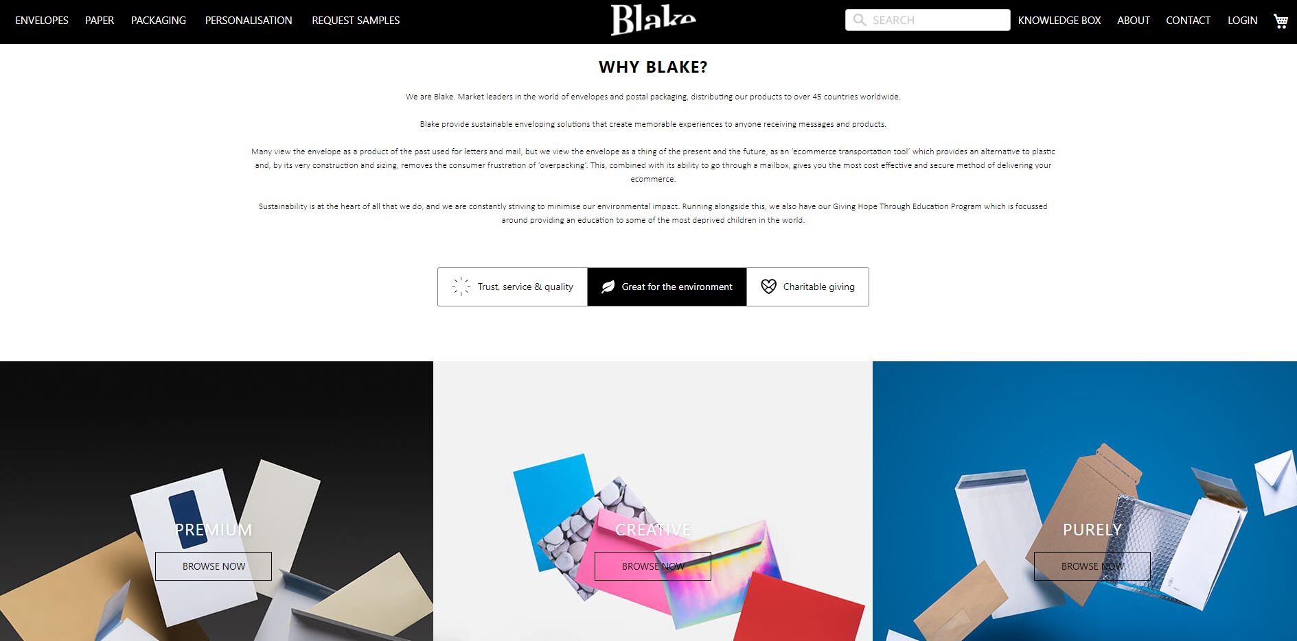
Nevertheless, the envelopes and postal packaging specialist has designed their website in a way that doesn’t make their products sound boring or forgettable. Here are a few ways they’ve achieved that:
- Eye-catching imagery in vibrant colours and creatively styled (e.g. photos of different types of envelopes falling to the ground but in an arty way)
- Buttons that change colour when you hover over them
- Impactful copy that simultaneously promotes Blake Envelopes’ market-leading status and passion for what they do
All of the above combined with easy navigational features (e.g. extensive filters so users can search by range, colour, style and more) hint to customers that the quality of Blake Envelopes’ products and service are as good as their website.
4. Quill’s all-inclusive package revolves around customer experience
Staples-owned Quill presents itself as a ‘one-stop shop’ for all things office and educational supplies. Despite there being a massive product database, it’s easy for customers to find what they need, thanks to extensive filters.
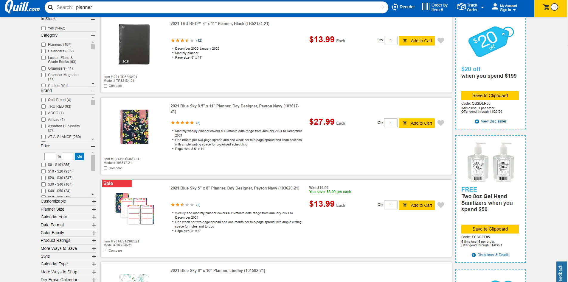
Not only can you filter by the usual category, brand, price range, colour and style (which most modern-day customers expect), you can also choose:
- Your own price range
- From various ‘ways to save’ (e.g. bundles, free gift options, buy and save)
- Product ratings
- Additional filters depending on the product you’ve searched for (e.g. for planners, you can filter by calendar year and book size, while for printers, you can filter by printer function, output type and more)
Plus, along the side of the search results page, customers can also see all the current promotional codes and their expiry dates. These features clearly put customer experience first, ensuring that customers can quickly find what they’re looking for even when the company’s product catalogue is huge.
5. Poly’s direct language puts customer needs first
It’s easy to put what you want on your website and talk the way you want. But what does your customer want? Video conference headset provider Poly is committed to putting their customer needs first and that’s obvious by just looking at their website.
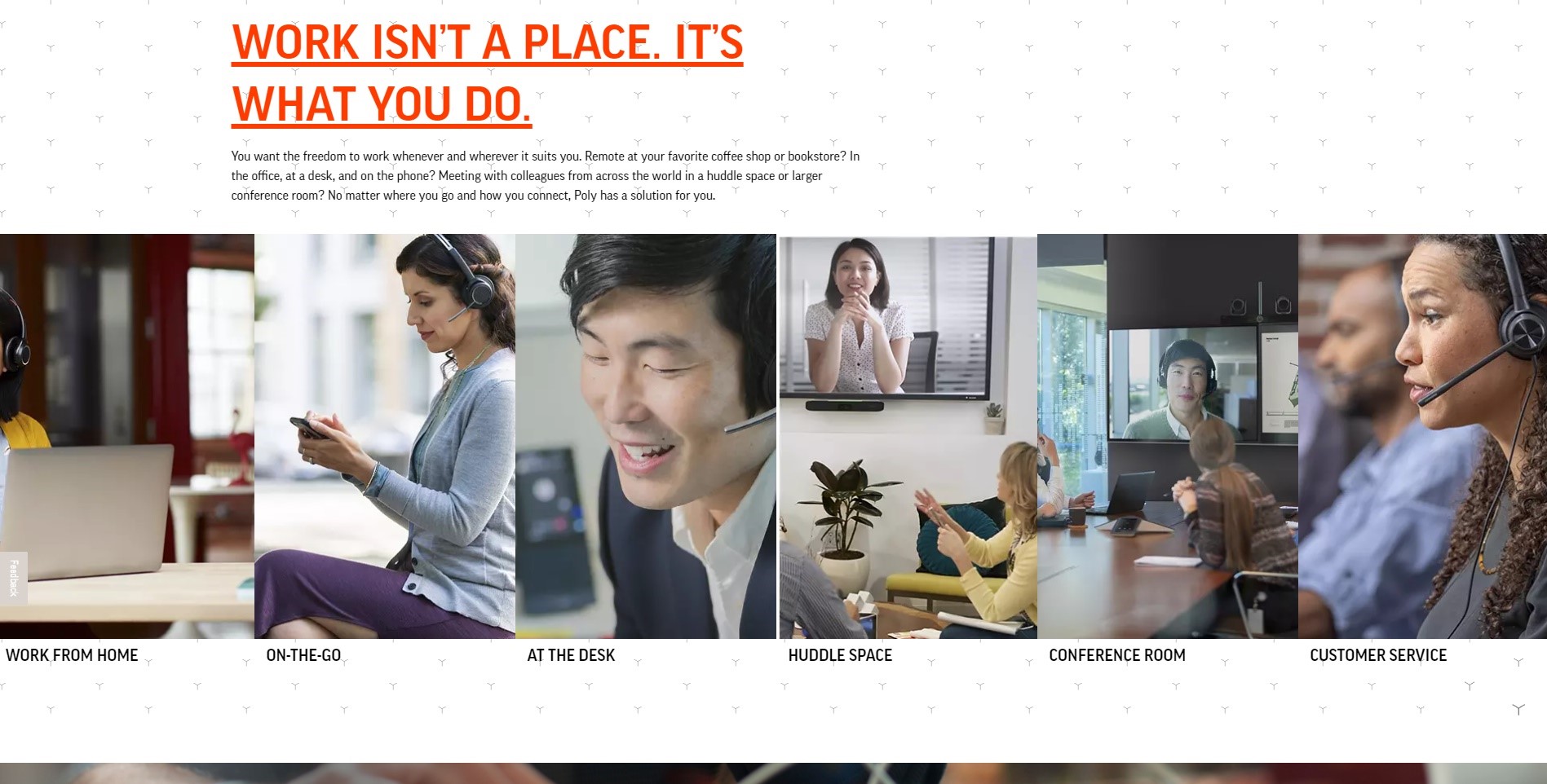
Rather than only saying what they do or leading with it, they start with their customer’s point of view. Take a look at the heading in the example above and the copy underneath. “Work isn’t a place. It’s what you do.” - we’ve highlighted the ‘you’ for a reason.
Then in the paragraph underneath, they go on to speak directly to the customer again. It’s a simple but effective tactic to put customers front and centre and one that every B2B company should always keep in mind. Customers first, products second.
Inspired and raring to go? Let’s keep that feeling going…
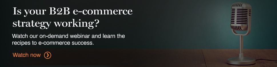
Hopefully, our examples have left you inspired and excited to revamp your e-commerce strategy. Before you start, we’ve got one last resource for you. We have a webinar where three experts on e-commerce came together to discuss how B2B companies can put together the perfect strategy.
Luckily for you, this session is available on demand. From navigating common B2B e-commerce challenges to the tactics you should be trying out, click the button below to hear their valuable insights.